
Deviation Actions
Daily Deviation


Description
The tutorial is based off of Photoshop CS6, though most other digital programs should have the same options used here available, they may just be located in other places than shown in this tutorial.
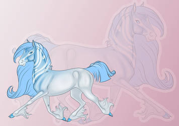
I also took the liberty or reusing the lines for this piece for the sake of this tutorial
:origin()/pre08/9916/th/pre/i/2016/061/2/b/a104_ass__k____deceased_by_astralseed-d9mrjc2.png)
If anyone has any questions or problems please feel free to leave them in a comment below and I'll do what I can to help you out.
Happy shading!
Edit:
Oh hey, a DD! Many thanks to RogueMudblood and Kida-neechan for suggesting and CelticStrm-Stock for featuring!
So just to be clear, this shading technique is in no way, shape, form, or fashion a proper way of shading. It merely is a simple and quick way to add depth and definition to your piece. This technique will not give you the range of color needed to really bring your art to life. You can easily build upon this shading technique in order to achieve the proper colors however by adding a new layer(s) and giving proper colors a place in your piece.
That being said, if you're just looking for something quick to add definition to your piece and you're not concerned with life like shading, this technique will likely be your best friend.
Going to plug some of my actual art here too:
:origin()/pre10/86fb/th/pre/i/2016/050/0/2/quirlicorn_landscape_by_astralseed-d9sdyrr.png)
:origin()/pre03/b3df/th/pre/i/2015/353/2/2/nine___environment_by_astralseed-d9iegzw.png)
:origin()/pre05/04ff/th/pre/i/2015/365/e/2/beads_winter_doodle_by_astralseed-d9m9iyn.png)
:origin()/pre11/8504/th/pre/f/2015/313/0/4/echo_potions_by_astralseed-d8m9ja9.png)
Another shading tip: If you want to show that the lighting is a different colour (i.e blue) make a shading layer and draw over the whole area you want to shade in blue, leave the line art above the shading, then add lighter blue in the places where there's lighting, then depending on the scene, add other colours, (examples if lighting is blue) if you want a cold scene, add accents of white, warm scene, add orange and pink, evil, add red, nature/good, add green, but make these highlight really subtle and only on the places where light hits directly, then set the layer to a multiply layer as it will make the piece underneath appear darker, the lighter areas will only tint the areas slightly but it makes a nice effect, you can switch between multiply and normal while shading is you want to see the effect